
Oil Prices, Explained
No finance background needed. Here’s how the price of oil is actually set — and what our gauge is really telling you.
01 It’s a tug-of-war
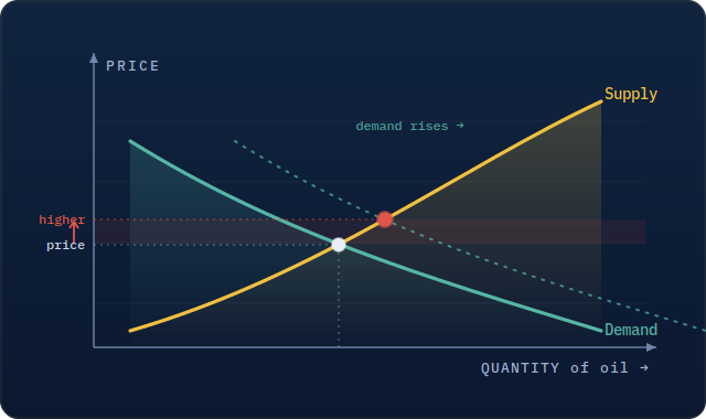
Oil is priced like anything else: supply versus demand. Demand is how much oil the world wants to burn — cars, planes, factories, heating. Supply is how much producers pump — Saudi Arabia, the OPEC group, U.S. shale, and the rest.
When the world wants more than producers are making, the price rises. When there’s more oil around than buyers need, it falls. The catch: oil trades globally, every second, so that tug-of-war re-prices constantly. The headline number you see is usually Brent, the main global benchmark.
02 Nobody can see the balance — so we watch the tanks
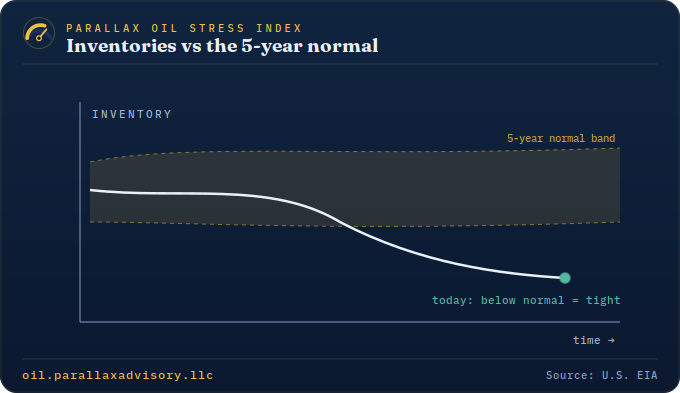
Here’s the problem: no one can directly measure how much oil the whole world is producing and burning in real time. But we can measure one thing — inventories, the oil sitting in storage tanks.
Think of inventories as the market’s fuel gauge. If tanks are being drawn down, the world is using more than it’s making — tight, bullish. If tanks are filling up, there’s a surplus — loose, bearish. The U.S. government (the EIA) publishes these numbers every week, which is why traders treat them as the real-time scoreboard.
03 The trick: it’s about the season, not the number
Raw inventory numbers are misleading, because storage naturally rises and falls with the calendar. Refiners build up gasoline before summer driving; heating oil before winter. So a big stockpile in spring might be totally normal — or a warning sign.
The honest question isn’t “how much is in storage?” It’s “how much is in storage compared to a normal year at this exact time?” We measure today against the average of the last five years for the same week. Below that line means tighter than normal; above it means looser.
04 What our gauge does
The Plumbline Petroleum Stress Index takes that idea and runs it across the whole picture at once — crude, gasoline, diesel, the Strategic Reserve, and how hard refineries are running — each measured against its own seasonal norm. It rolls them into one number from 0 to 100.
A high score means the oil market is unusually tight for the time of year. A low score means it’s unusually loose. The needle is just a plain-English read on how stretched things are right now.
05 The part that surprises everyone
You’d assume a tight market means prices are about to climb. Often, the opposite happens.
Across 18 years of data, when the market has been this tight, oil prices have more often drifted lower over the next three months, not higher. Scarcity pulls demand forward and invites producers to pump more — and the market snaps back. So a high score is a caution flag on price, not a green light to buy. A very low score has tended to mark the better entry, not the exit.
This is why we call it a stress gauge, not a price prediction. It tells you how stretched the rubber band is — history says stretched bands tend to snap back. It’s one useful input, not a crystal ball, and it’s sharpest during gluts and shocks, quietest in calm stretches.